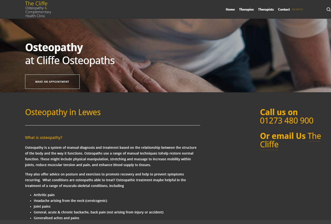
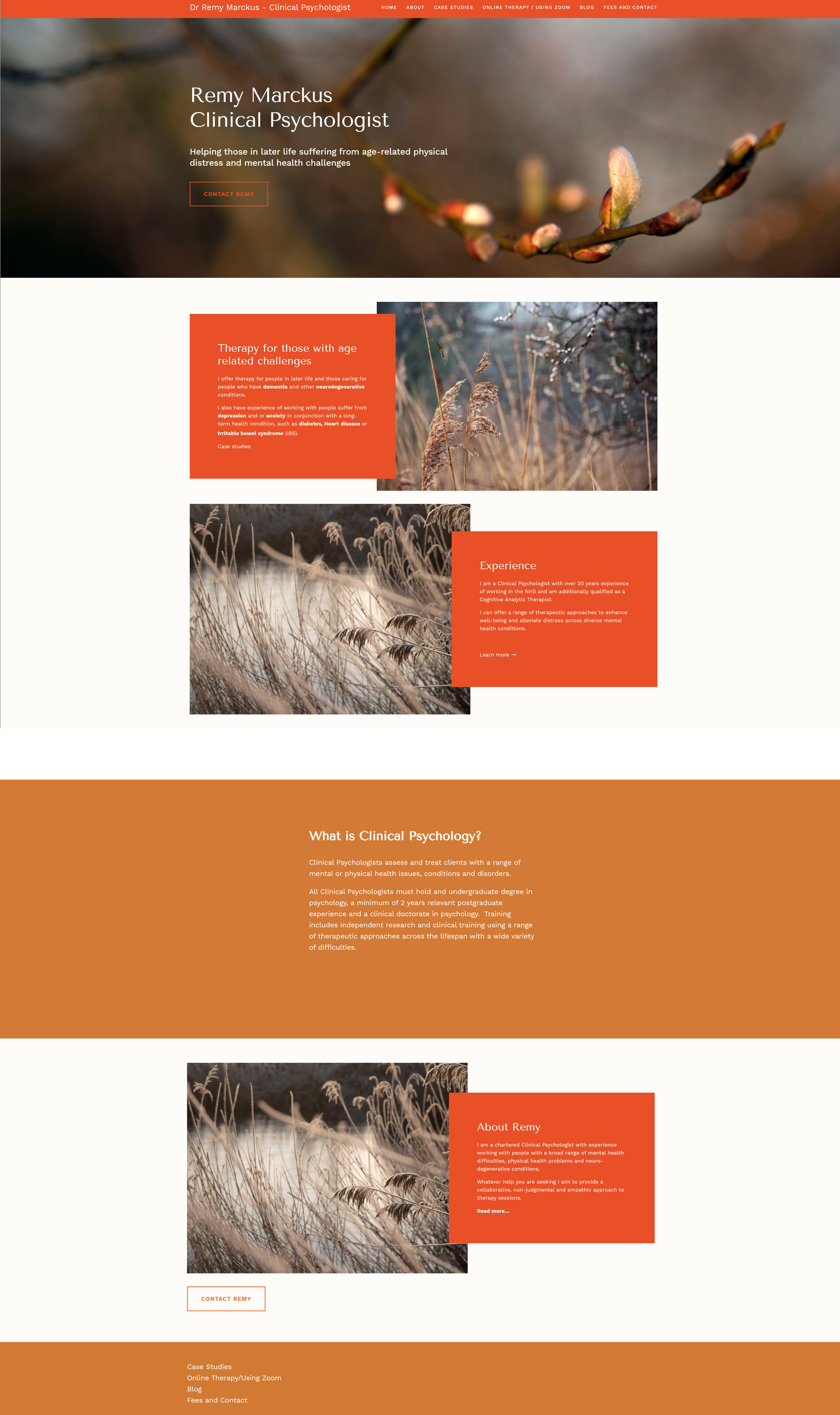
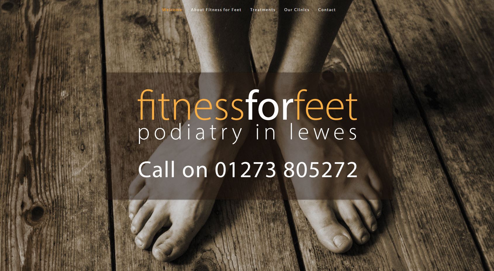
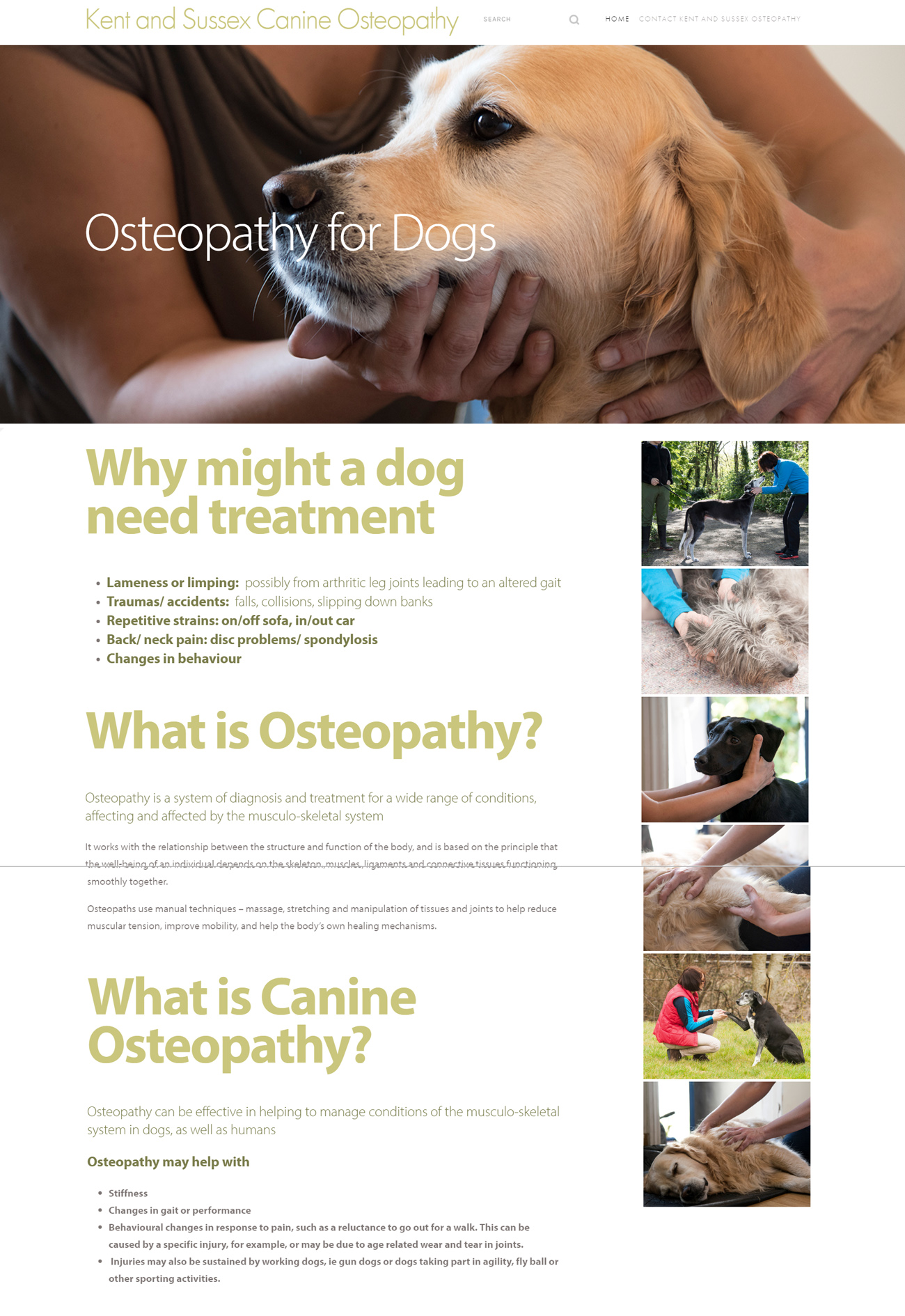
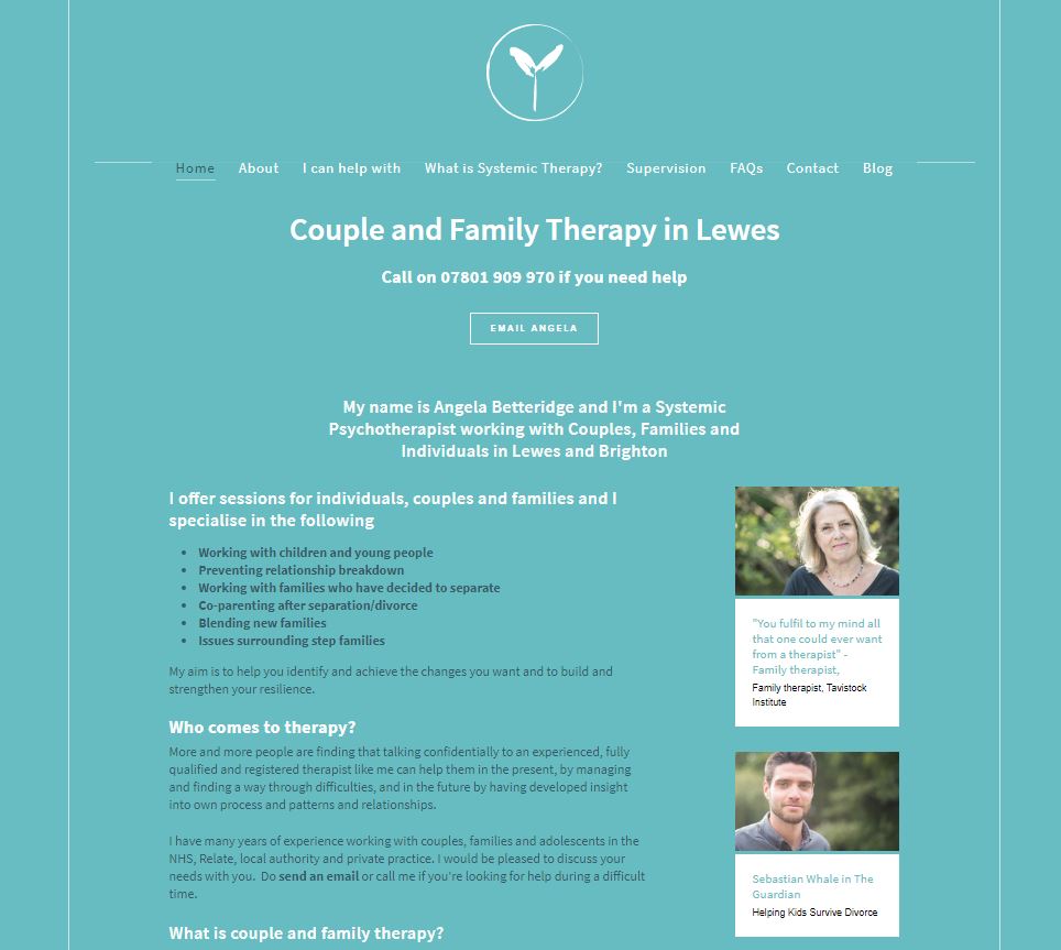
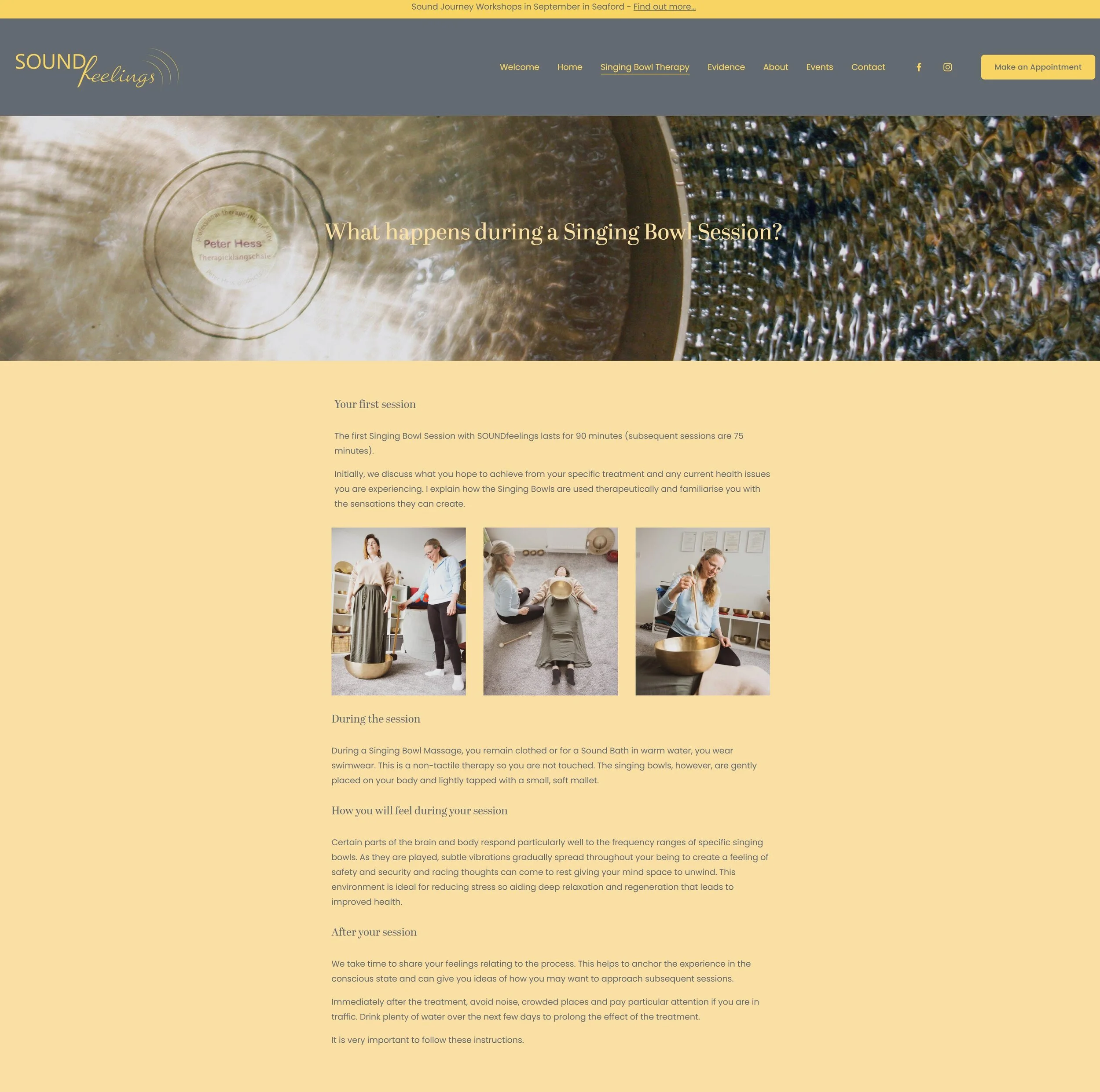
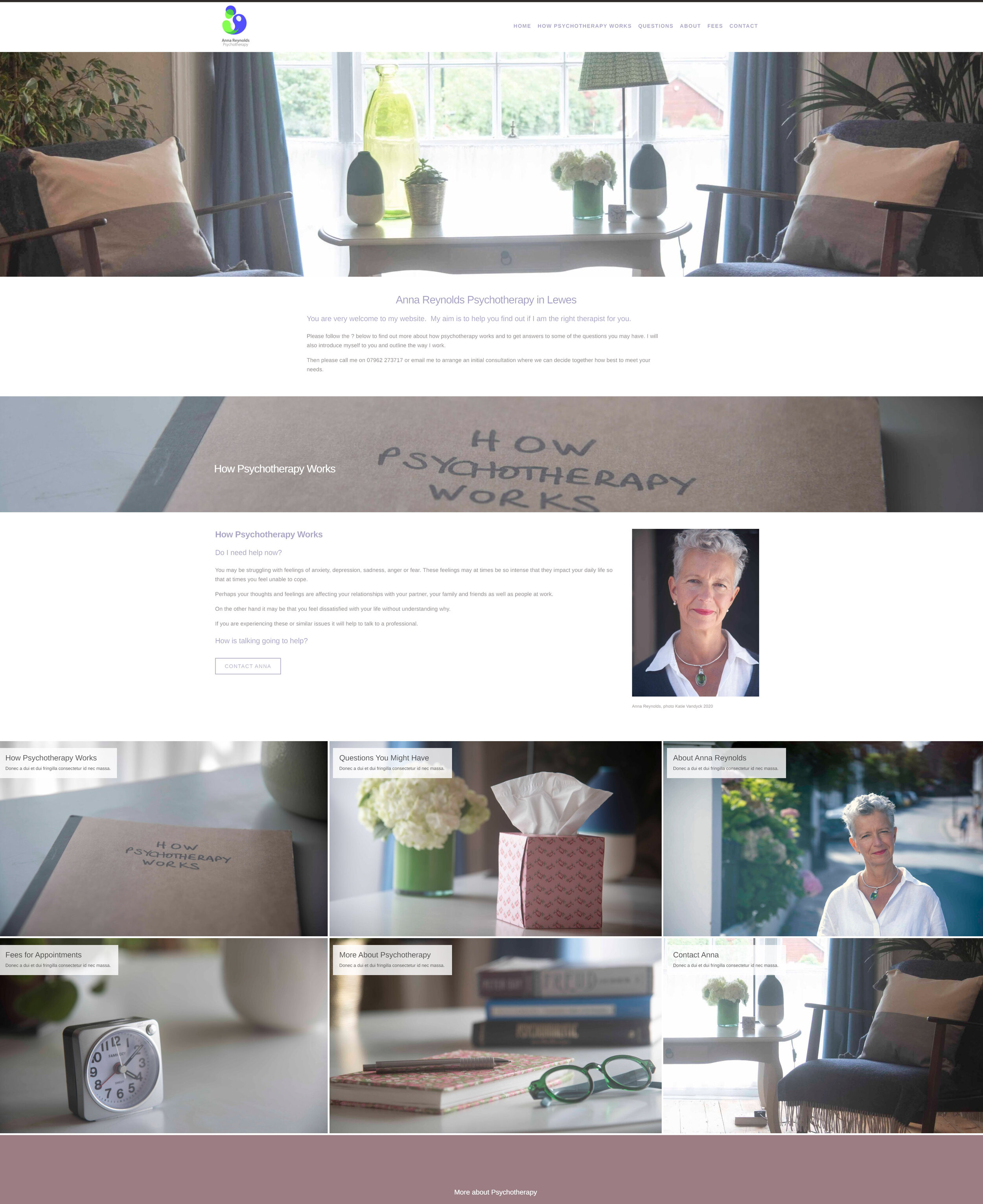
A therapist’s website needs to be 100% authentic
Trust is the basis of therapy
This means clarity of expressions is very important, not just in terms of website navigation and structure but also the integrity, readability and amount of content
Five things to think about when putting together a therapist’s website
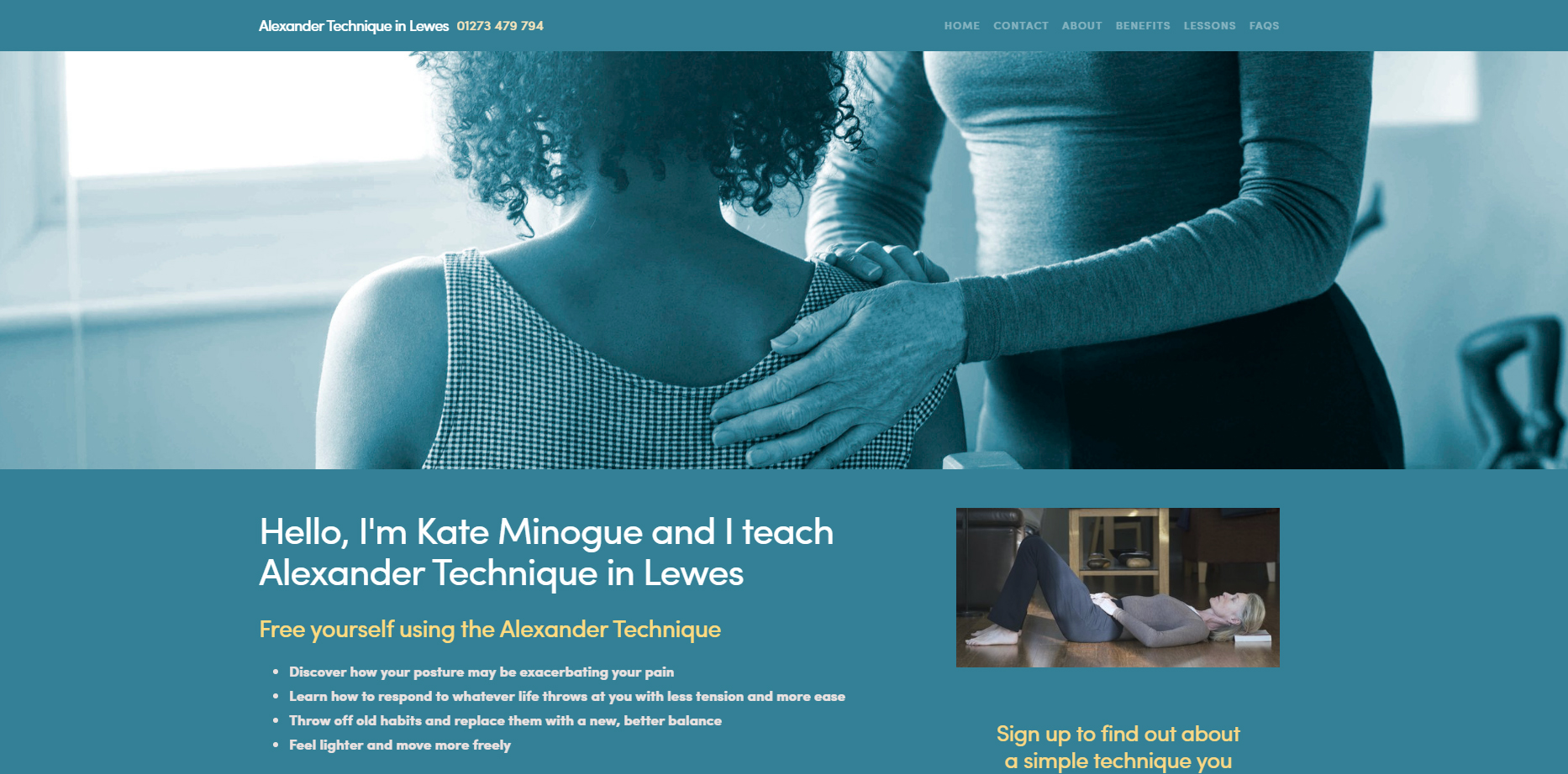
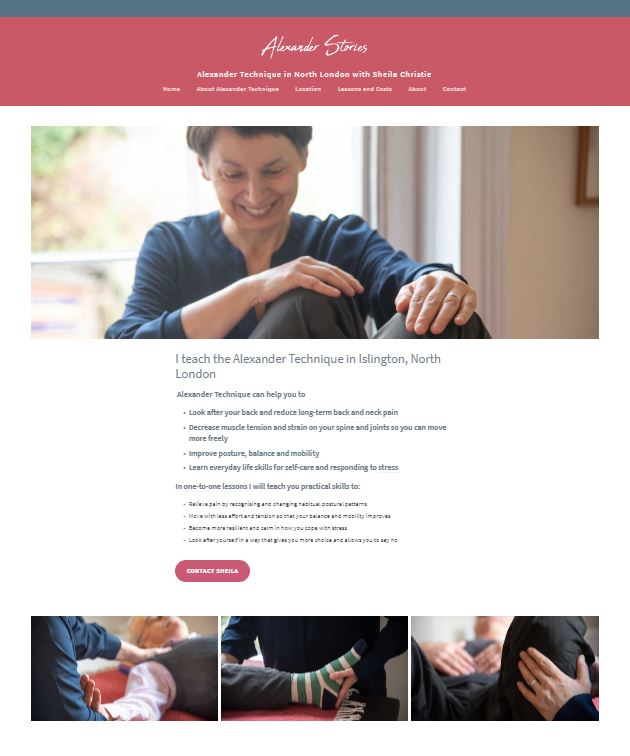
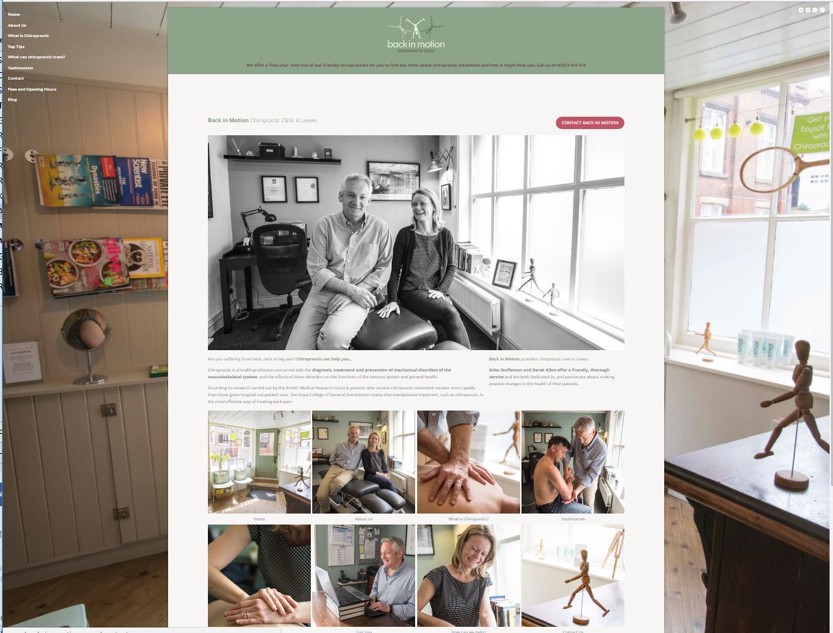
Library photographs won’t do, they feel inauthentic
Photographs taken in a studio aren’t as appealing as those taken in natural light, they seem (they are) staged. This takes away from the apparent authenticity of the offering
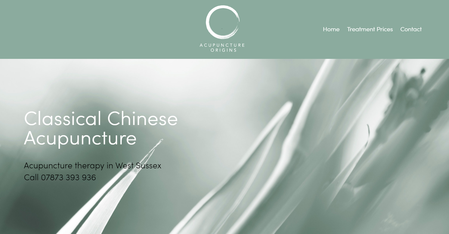
Too much text is unhelpful, your visitor will almost certainly prefer something calm, spare, something that won’t feel overwhelming
The same is true of clutter on the page. An anxious or stressed visitor will feel more comfortable with a sense of space and light than with the claustrophobia of unsympathetically laid out text or images, lots of bright colours, visual stuffing
Genuinely useful information around your particular therapy will promote you as an expert which in turn can help with search engine ranking


