The Case Against Library Photographs on Websites
The Power of Subliminal Communication
The Gavel from Murder Mystery Games website by Katie Vandyck
This doesn't need an article. Just a list.
1. Google likes original websites by which I mean a website that can only be produced by one particular person, is unique to them. A library shot is the antithesis of original.
2. Google is thought to penalise duplication. If you're using a library shot, you won't be the only one using that shot.
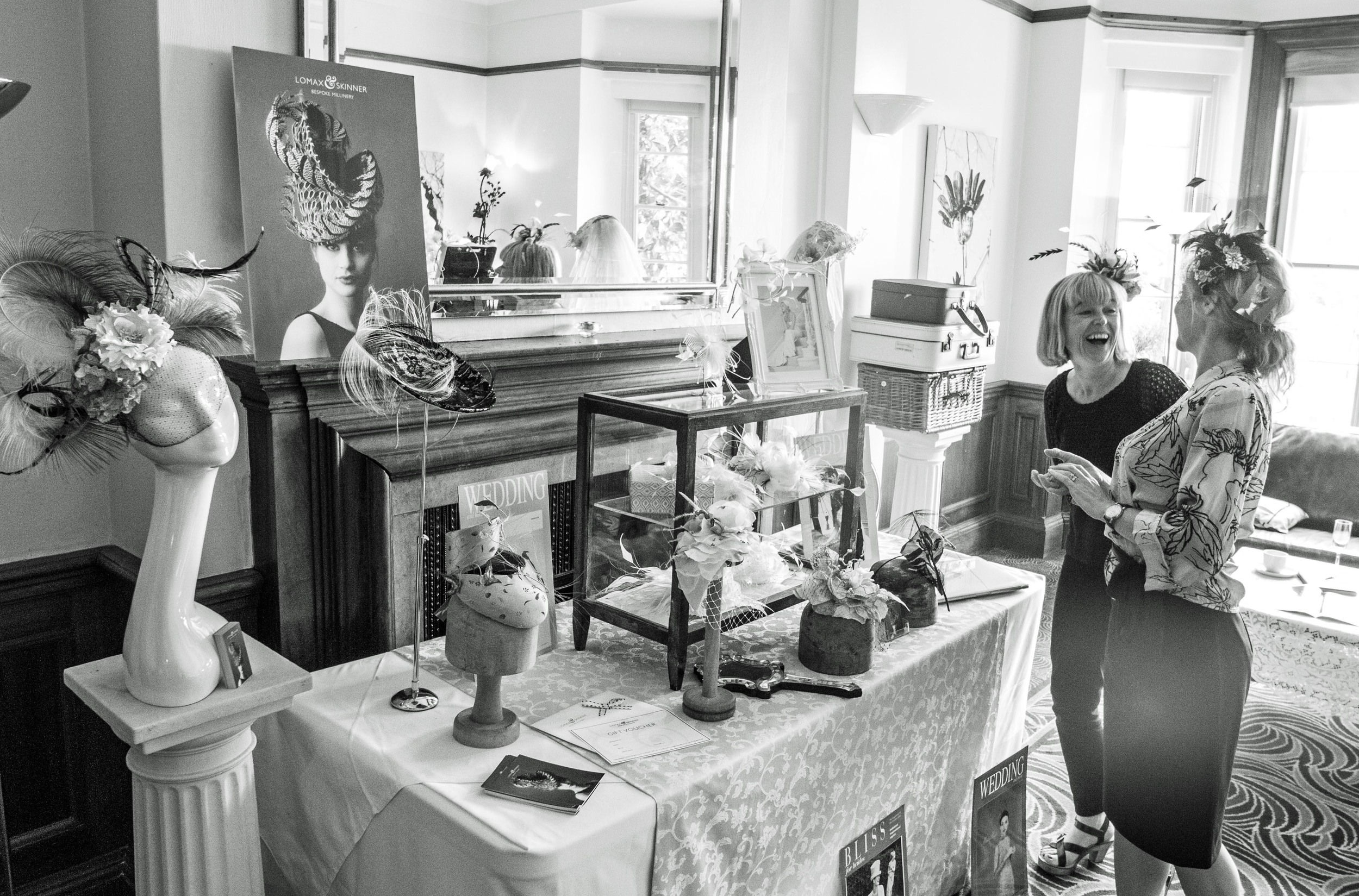
3. A shot taken of your business will be uniquely about your business, and no one else's. As such it will add subliminal information to your website about the quality of what you do and the effort you are prepared to put into it.
4. If you've taken the trouble to get a good photograph taken specially for your website your visitor will infer that you bother in other aspects of your business too.
5. A library shot will often be perfect. Perfect is enjoyable to look at, but it isn't real. Your business is real. Make your photographs real too.
6. Library shots are the equivalents of visual clichés. They are dropped in when the person using them isn't completely clear about what they want to say.
We know that the power of an image is in the subliminal, emotional connection it makes on the viewer. Because engagement is unconscious the impact of the image is all the more influential on the way somebody feels about your website, your business.
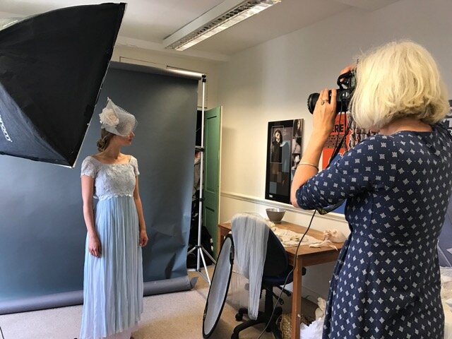
Find ways of taking your own photographs or engage a photographer (I know a good one).
Always think very carefully about your photos. They tell your story in the subtlest of ways, by implication, so much more powerful than overt statement
The battle for engagement can be lost, or won, on a photograph. Make them as good, as high quality, as attractive as they can be
© Katie Vandyck 2024


